Futurpreneur
Brand management

Futurpreneur is a national nonprofit that funds and mentors young entrepreneurs across Canada. As the organization expanded programs and partnerships, they needed a clearer brand story and a 360 campaign system that could scale from coast to coast—print, events, digital, and partner co-brands—without reinventing the wheel each time.
Role & mandate
We act as an embedded brand lead: brand design → identity refresh & guidelines → national campaign design → rollout & governance. Day-to-day we partner with marketing, partnerships, and regional teams to keep the story consistent while making space for local activation.


Challenge
Great programs, scattered expression. The brand showed up differently across regions and vendors, making it harder to recognize quickly and harder for internal teams to produce at speed.
Strategy
Codify the brand into a usable system (distinctive type/color, layout behaviors, motion & caption rules) and an always-on cadence that carries the story across moments: funding windows, cohort launches, mentorship drives, and partner events.
System & creative
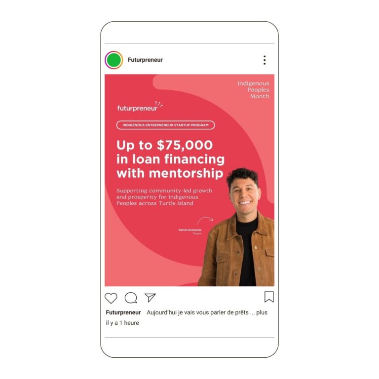
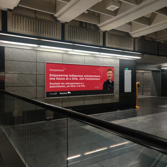
Identity refresh: type hierarchy that reads at a distance (OOH/posters) and on phones; color pairs tuned for legibility; flexible grid that supports portrait/landscape and bilingual EN/FR.
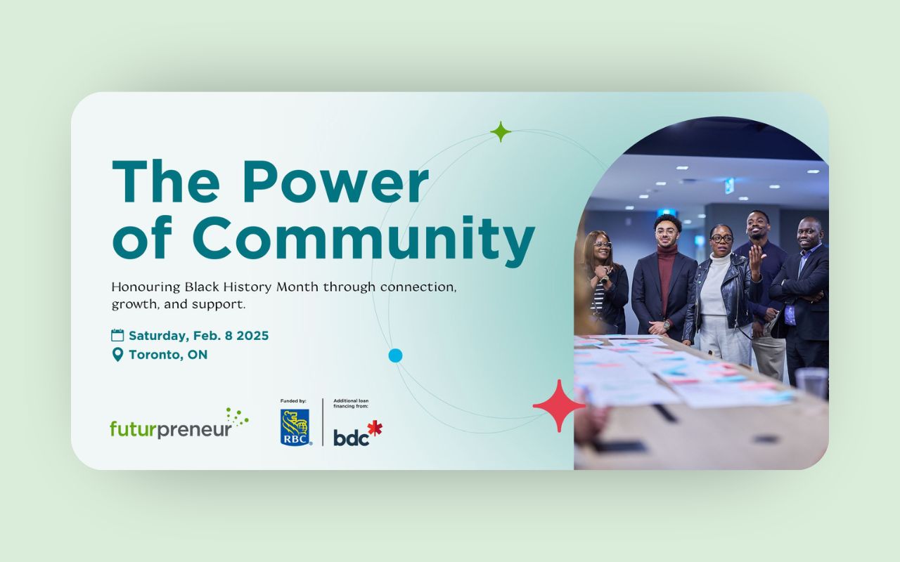
Campaign toolkit: poster series, OOH, event signage, digital units, and a social pack (reels/story templates, quote cards, cohort spotlights).
Co-brand rules: clean space, lockups, and tiered partner treatments.
Ops, accessibility & governance
WCAG-informed contrasts, minimum sizes, caption/subtitle guidance, and bilingual templates so regional teams can ship on-brand assets without hand-holding. Simple approvals (craft vs. brand) and a shared asset library reduced back-and-forth.
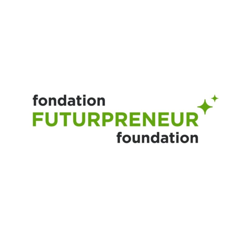
In parallel, we built the Futurpreneur Foundation as a sister brand—clear in purpose, visibly related to the parent, and ready for philanthropy. We defined the brand architecture (endorsed lockups, color/typographic lane), a donor-friendly voice and narrative, and a modular communications kit. EN/FR templates and accessibility standards (contrast, type, caption/alt conventions) keep fundraising materials partner-ready for corporate patrons and events while preserving coherence with the main brand.


Outcome
A recognizable national presence that travels, from posters and partner decks to reels and event signage, plus an internal toolkit that shortened production and kept the story coherent across regions. (Impact is multifactorial; our remit was the brand system and campaign layer that made scale possible.)